People born in the 1990s are twice as interested in spirituality as compared with those aged over 65. So why was it that the membership of White Eagle Lodge — a global spiritual organisation founded on the teachings of a spirit in the higher realms named White Eagle and with an increasingly broad range of services — was overwhelmingly over 65?
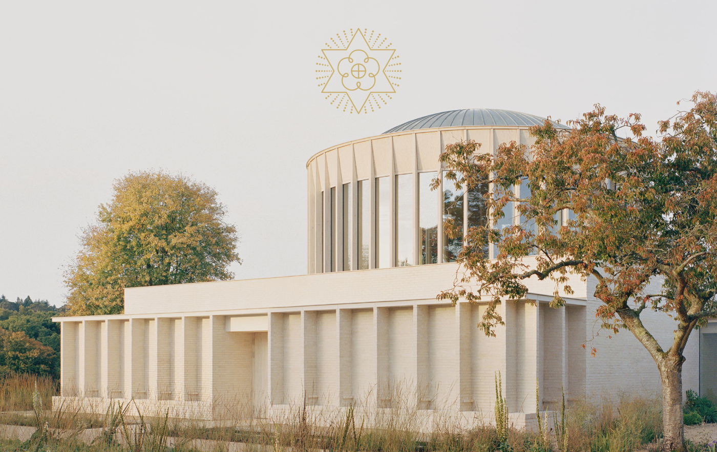
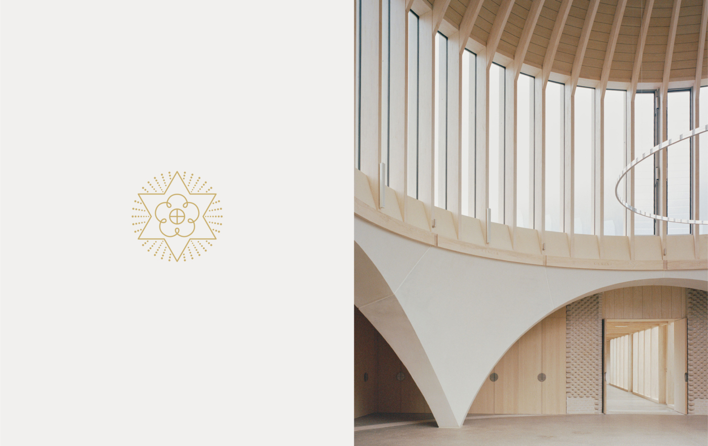
The organisation tasked us with refreshing its identity, giving its messaging greater clarity and communications greater elegance in order to appeal to younger audiences. We isolated and reinvigorated the organisation’s cherished symbols — the six pointed Christ Star, the cross and circle of light, and Tudor rose — and placed them at the very heart of their identity. Around this we delivered a brand system which will ensure the integrity of the organisation’s identity for many years to come.